
Alaska Wilderness League: Rebrand
Creating a bold, flexible brand to protect the wild heart of Alaska
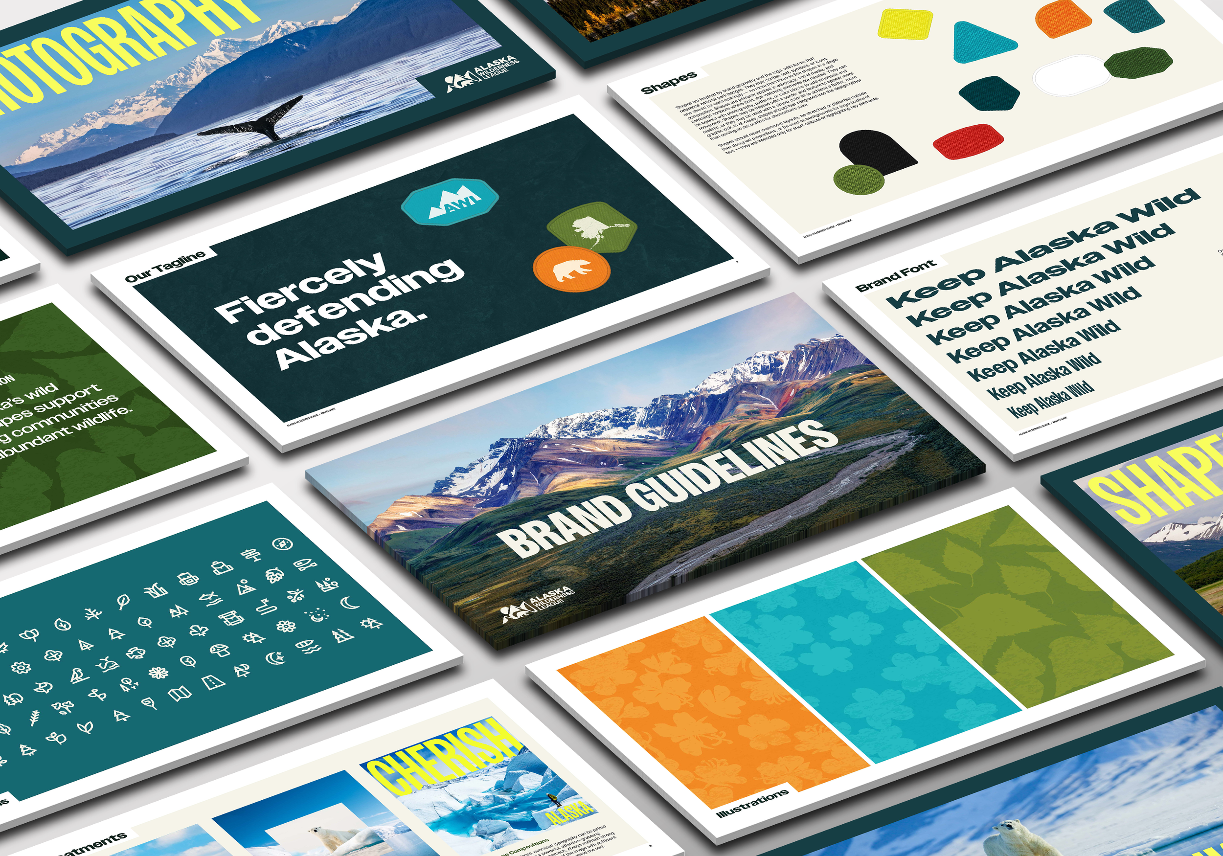
At Taoti, I led the art direction and brand development for Alaska Wilderness League, redesigning their logo and creating a full visual identity system that’s as bold, energetic, and unapologetically wild as the landscapes the organization protects.
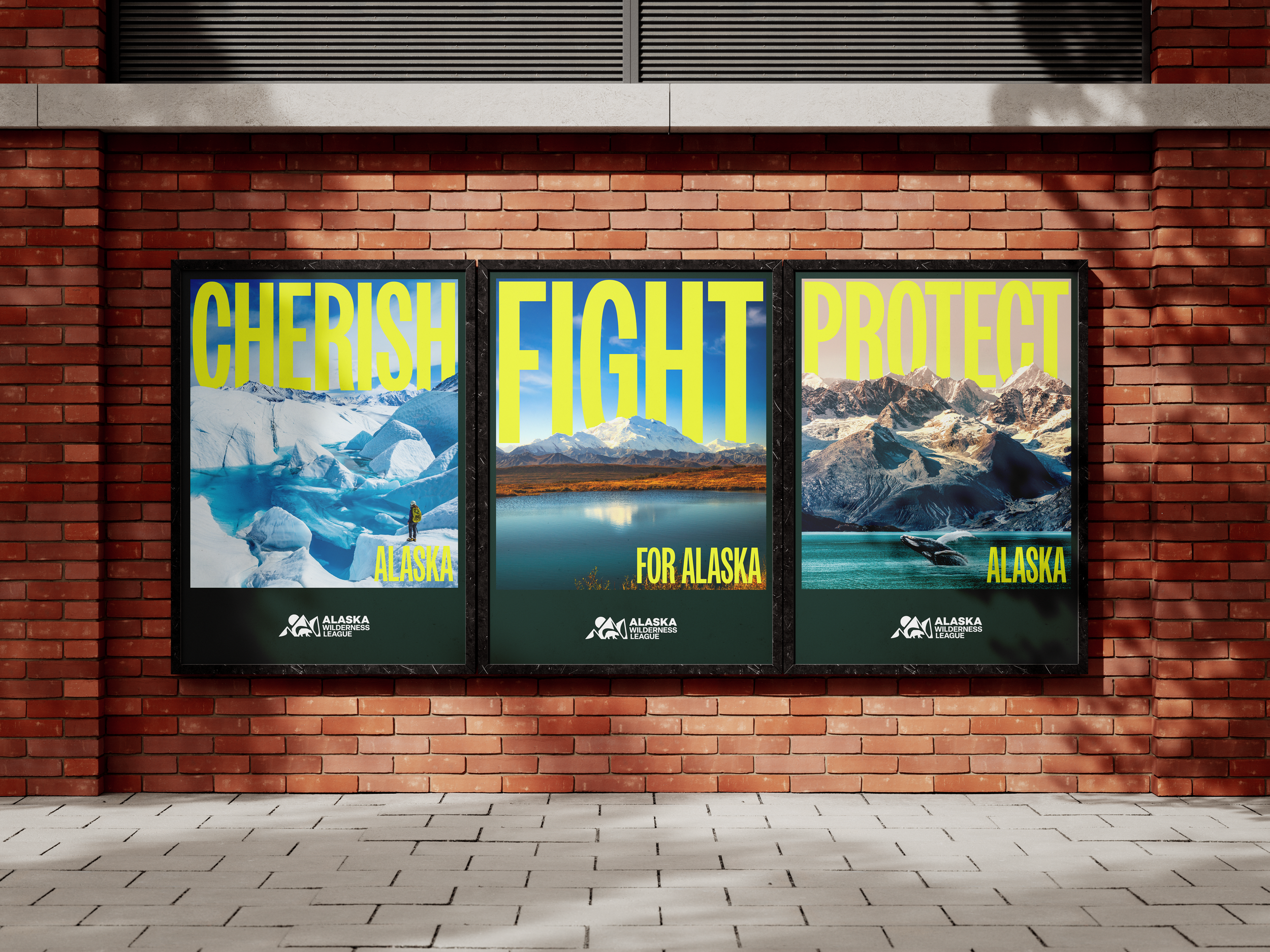
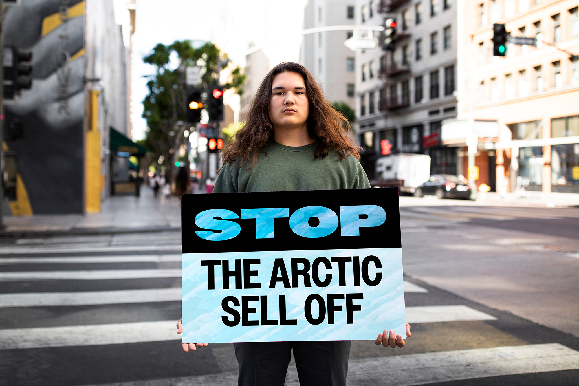
The core of the system is typography. I chose Owners, a variable typeface inspired by the energy of handmade protest and advocacy signage. Its flexibility allows the brand to flex—from loud and attention-grabbing when rallying activists to measured and clean when communicating with donors and decision-makers—always carrying a human, grassroots spirit.
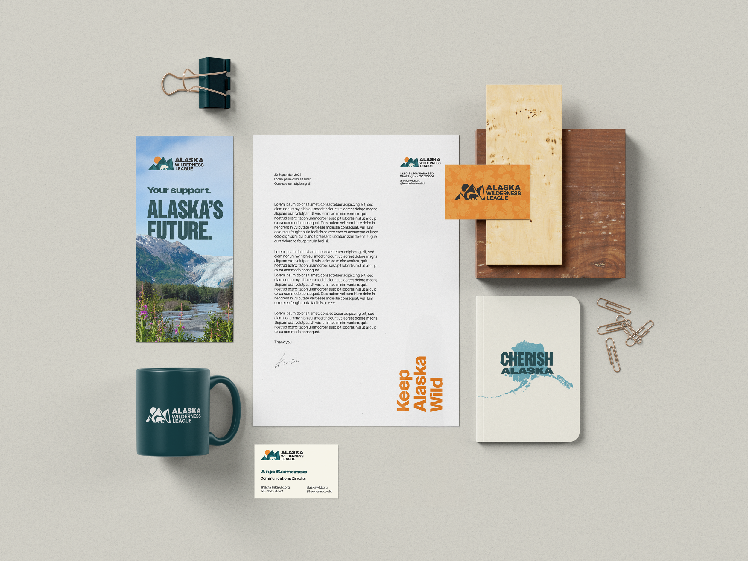
The color palette balances nature and activism: grounded greens and deep blues reference Alaska’s forests, tundra, and waterways, while neon yellow, bright orange, and strong red inject urgency, energy, and movement. Neutral tones of cream, white, and near-black gray provide contrast and credibility.
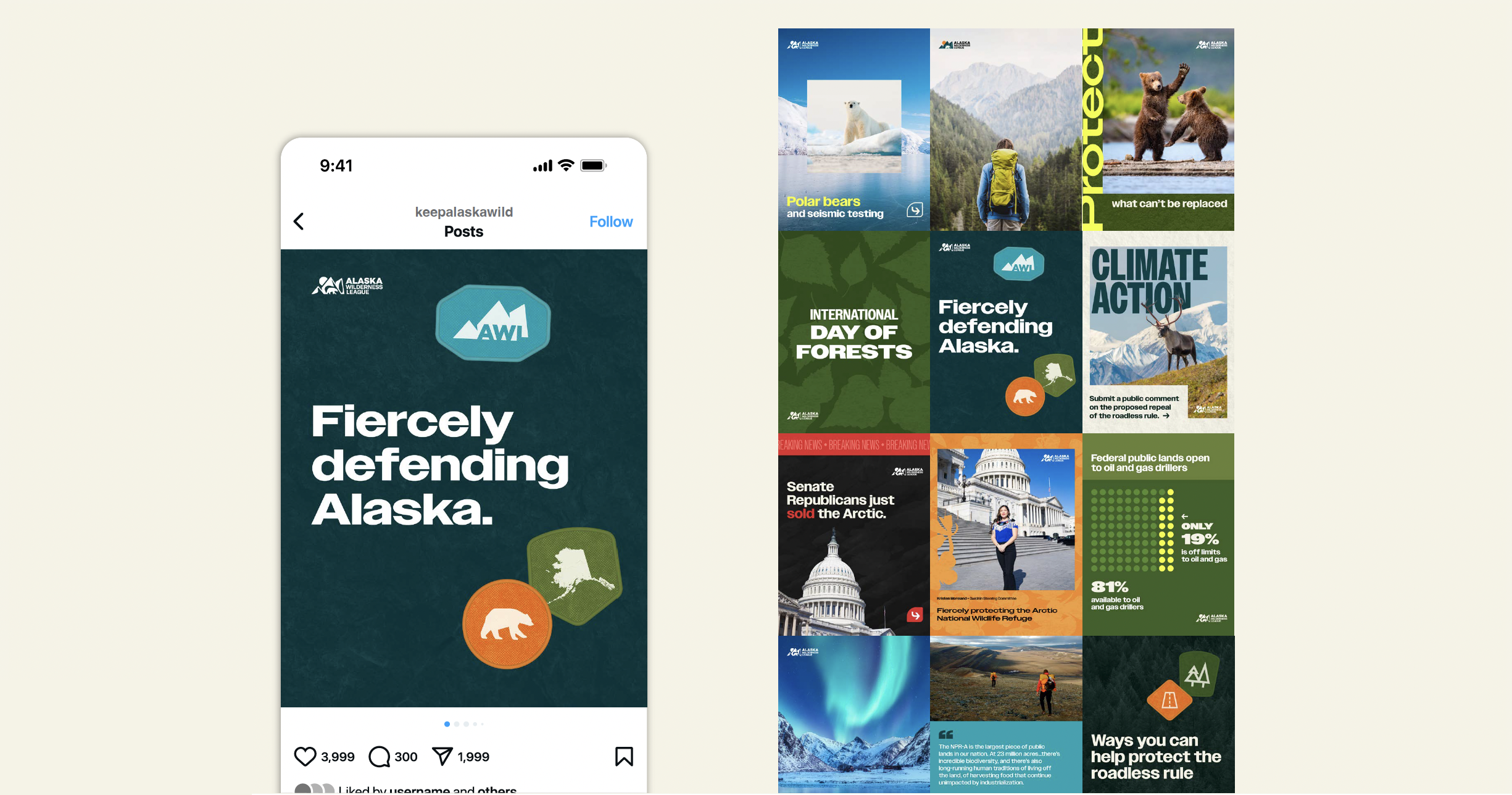
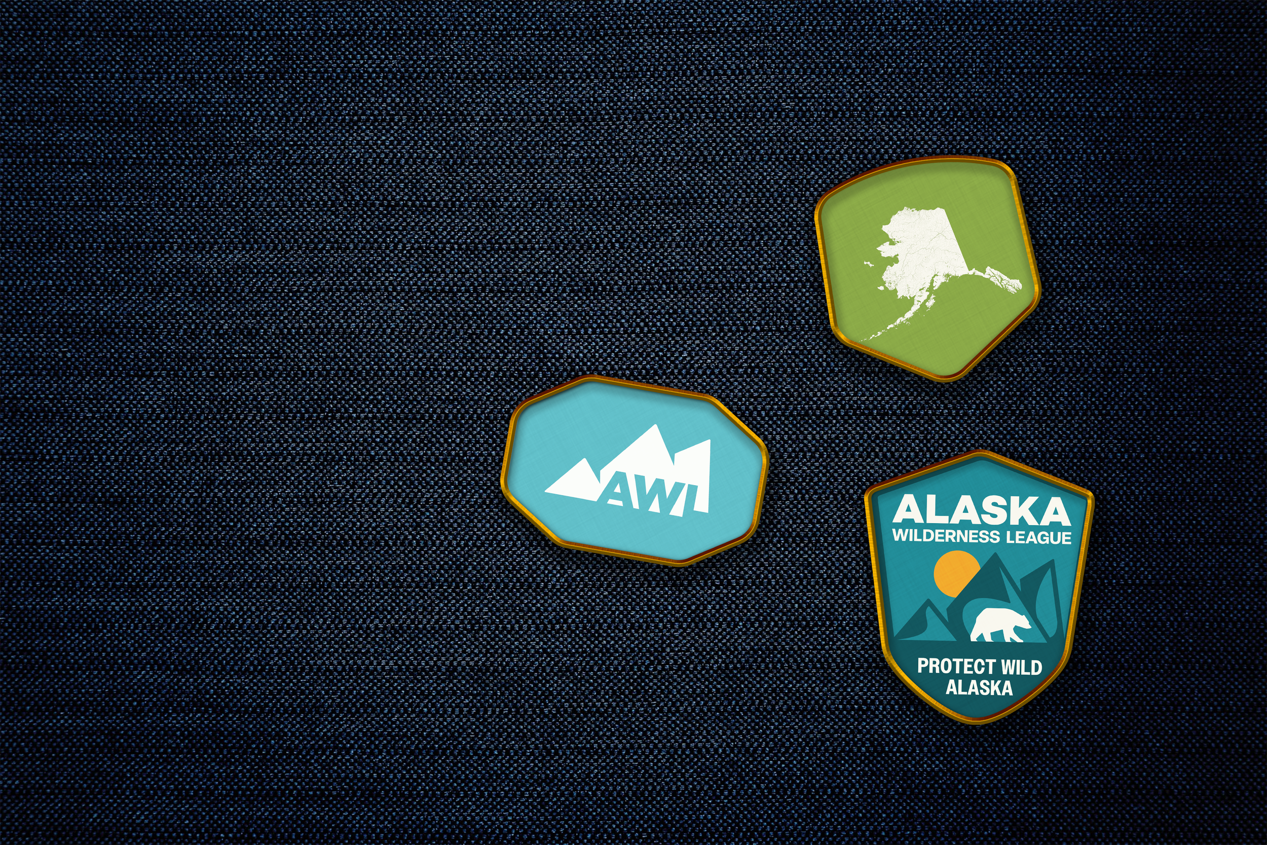
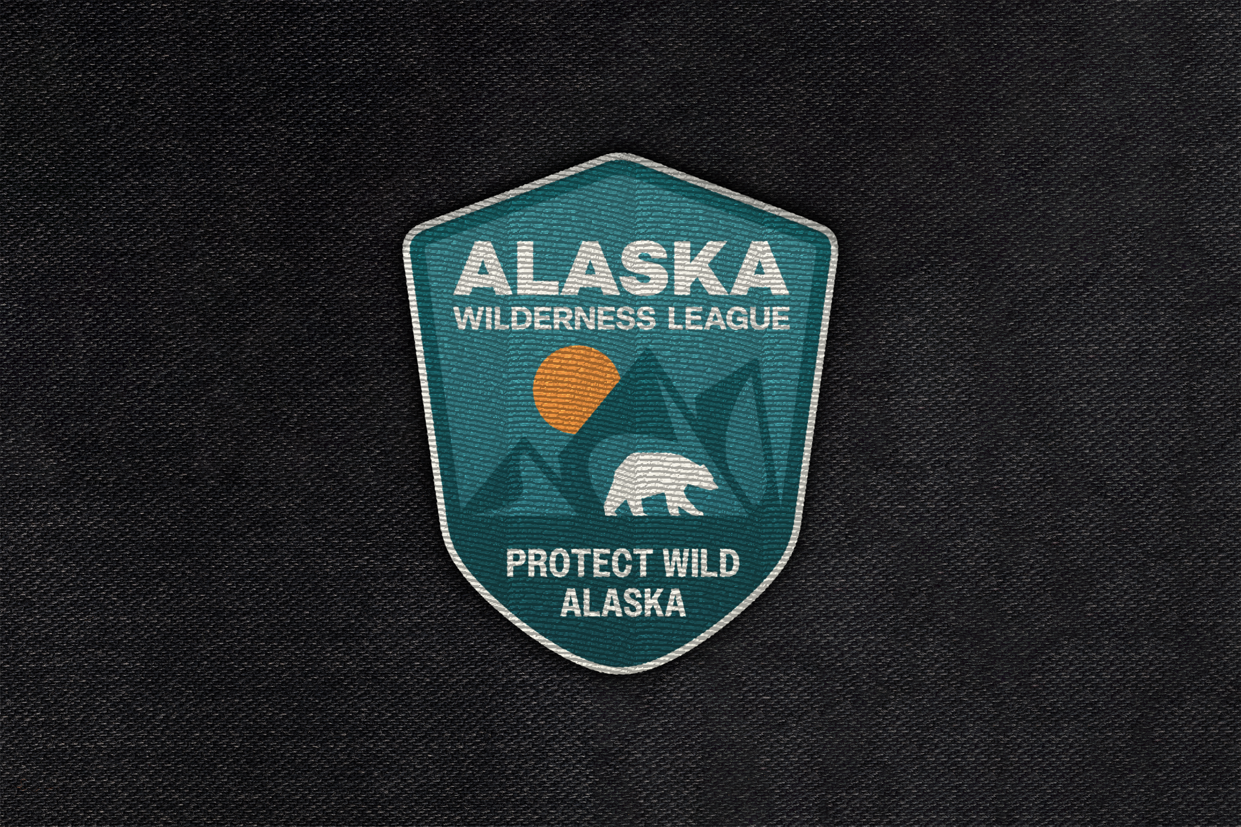
Texture, illustration, and pattern draw directly from Alaska’s landscapes and flora, creating a sense of place that’s unmistakably local. Geometric icons echo the logo shapes, establishing a consistent visual language across advocacy, exploration, and community engagement.
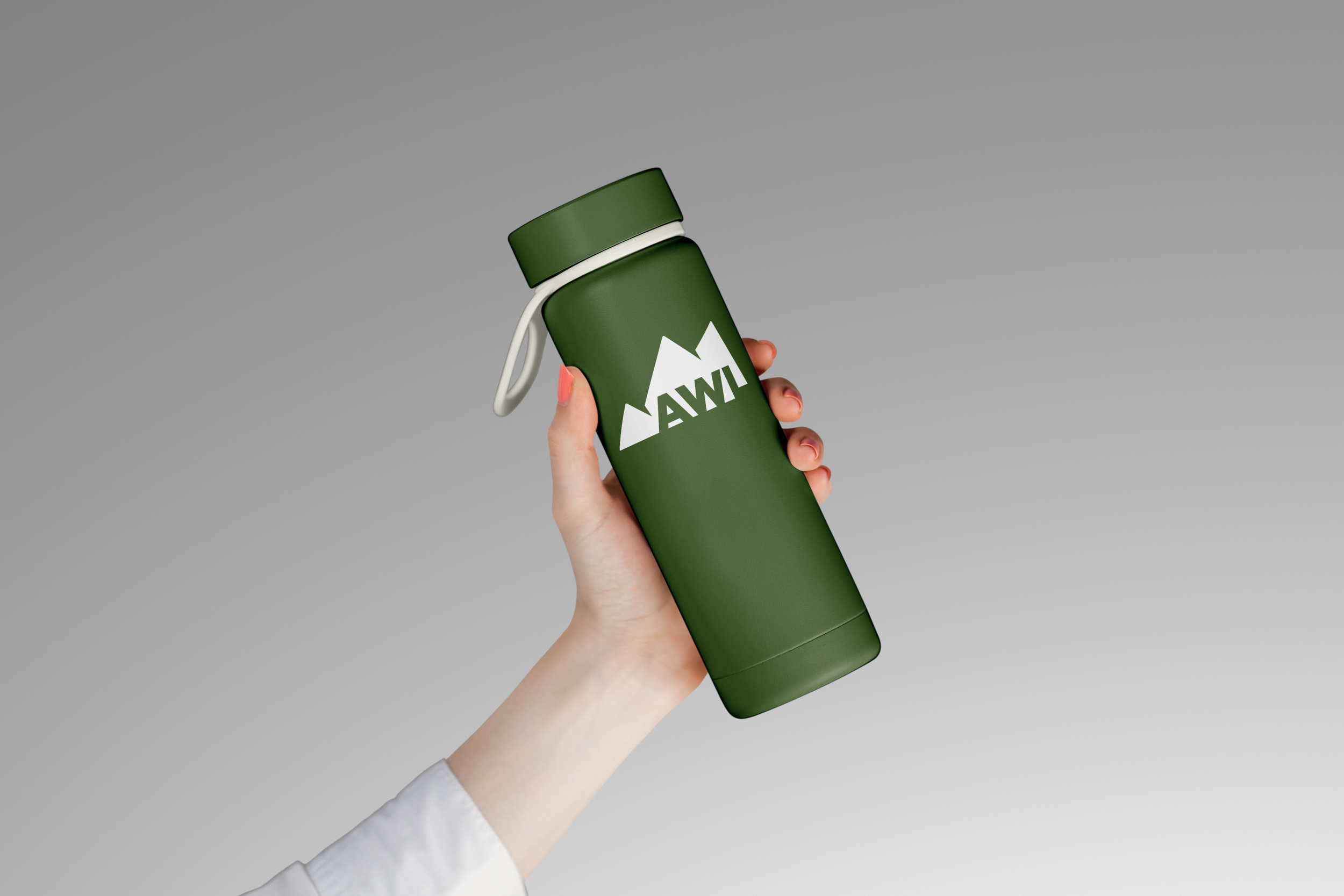
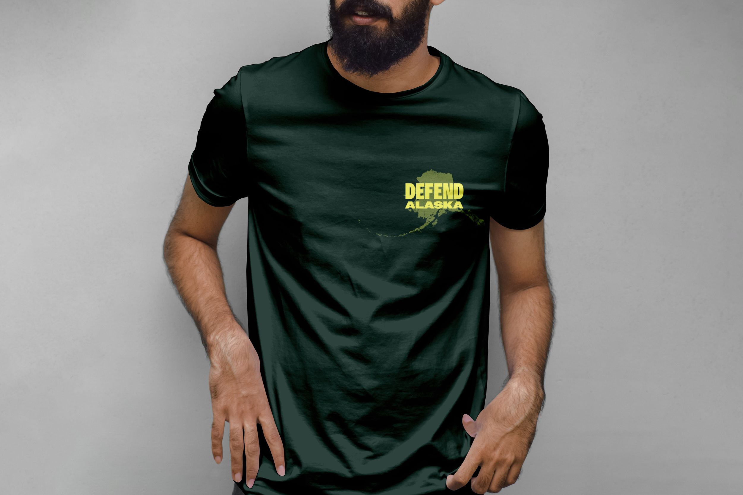
The system flexes across platforms: stationery is professional and trust-building, while poster and social campaigns use oversized type, bright colors, and layered elements to create energy and urgency. The identity translates seamlessly to protest placards, digital-first activism content, and merchandise that supporters want to wear and keep.
The result is a dynamic, versatile brand that embodies stewardship, strength, and clarity—reflecting Alaska Wilderness League’s mission to protect the wild heart of Alaska while connecting with audiences from longtime donors to new activists.
Services