
New York Academy of Medicine: Rebrand
Creating a modern, data-driven identity built for health progress
At Taoti, I co-led the art direction and brand development for The New York Academy of Medicine, helping transform a legacy institution into a bold, modern brand that better reflects the urgent, data-driven work they’re doing today.
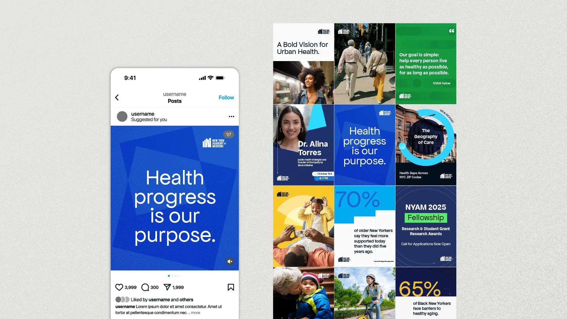
NYAM came to us with rich research and a new strategic positioning centered on health progress. We used those insights as our foundation, building a visual identity around the intersection of people and data, showing how evidence, community, and collaboration move health forward.

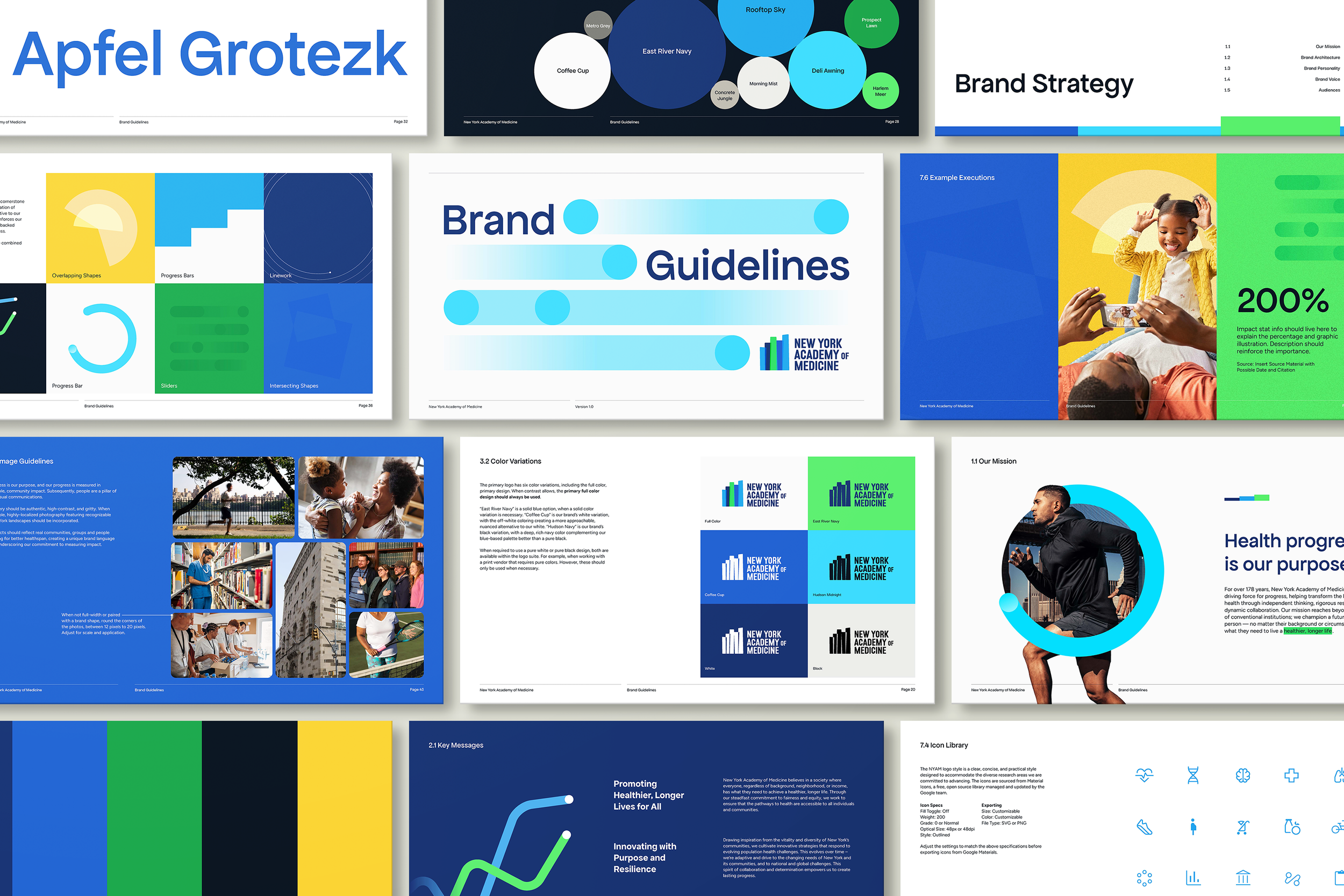
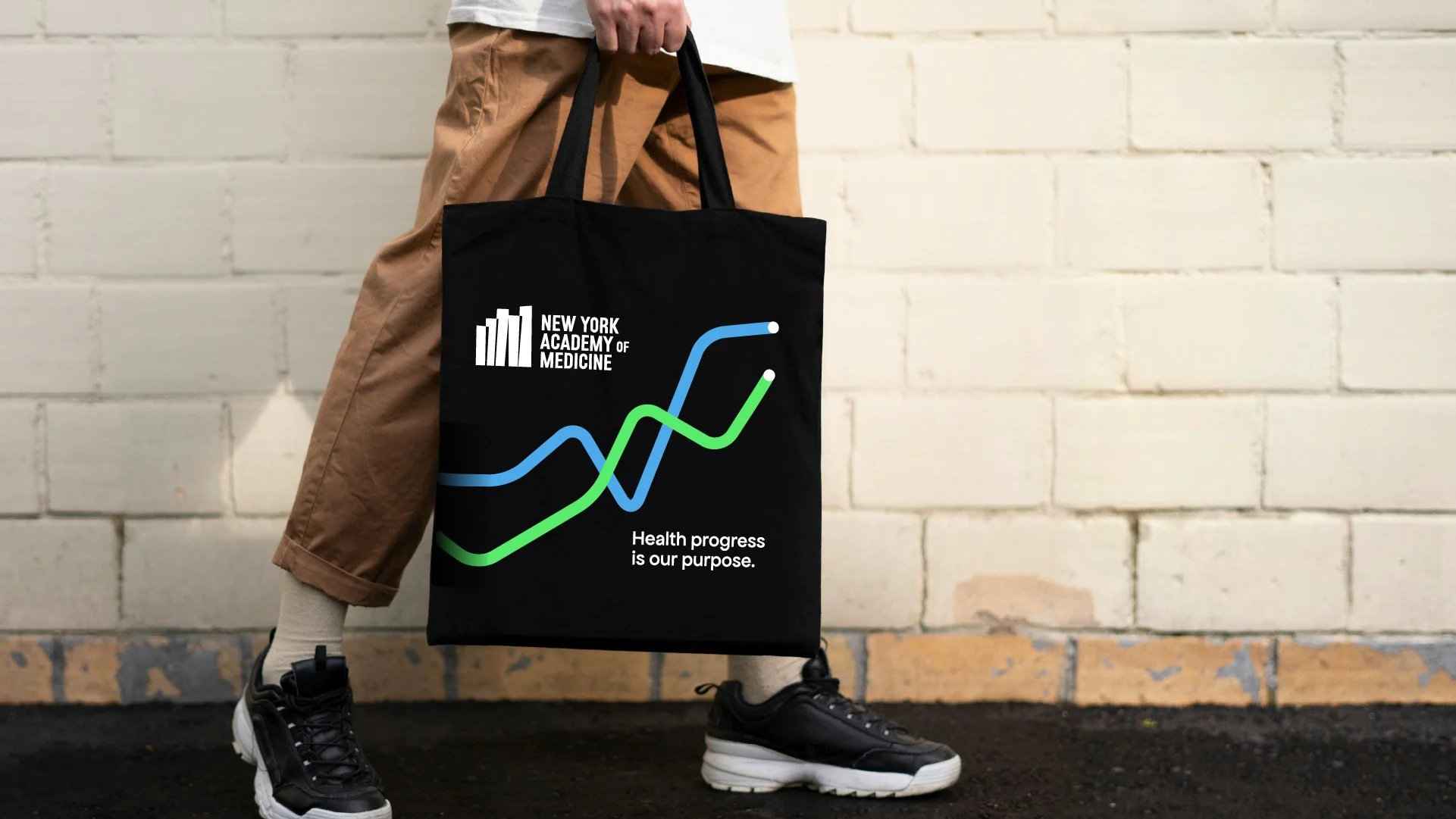
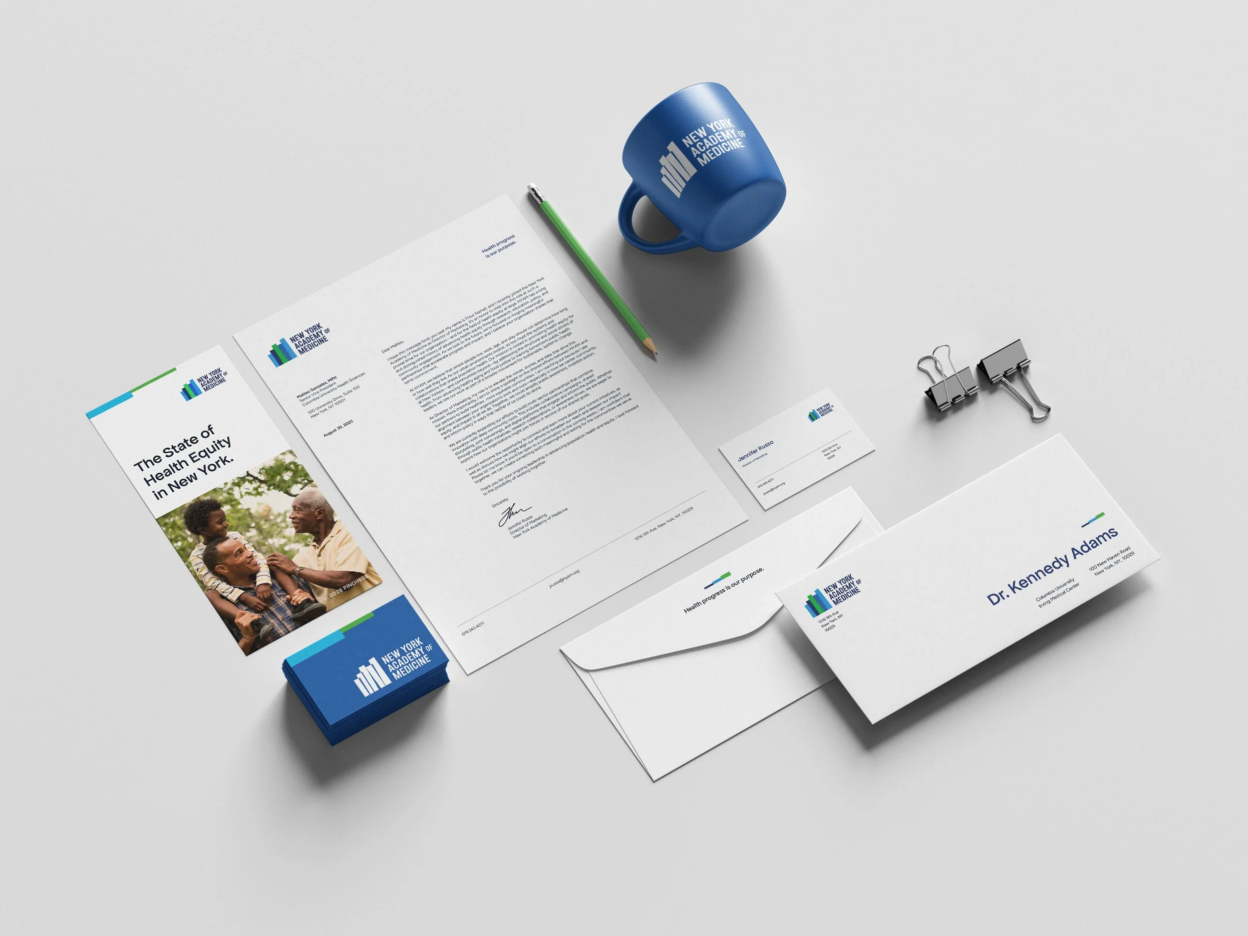
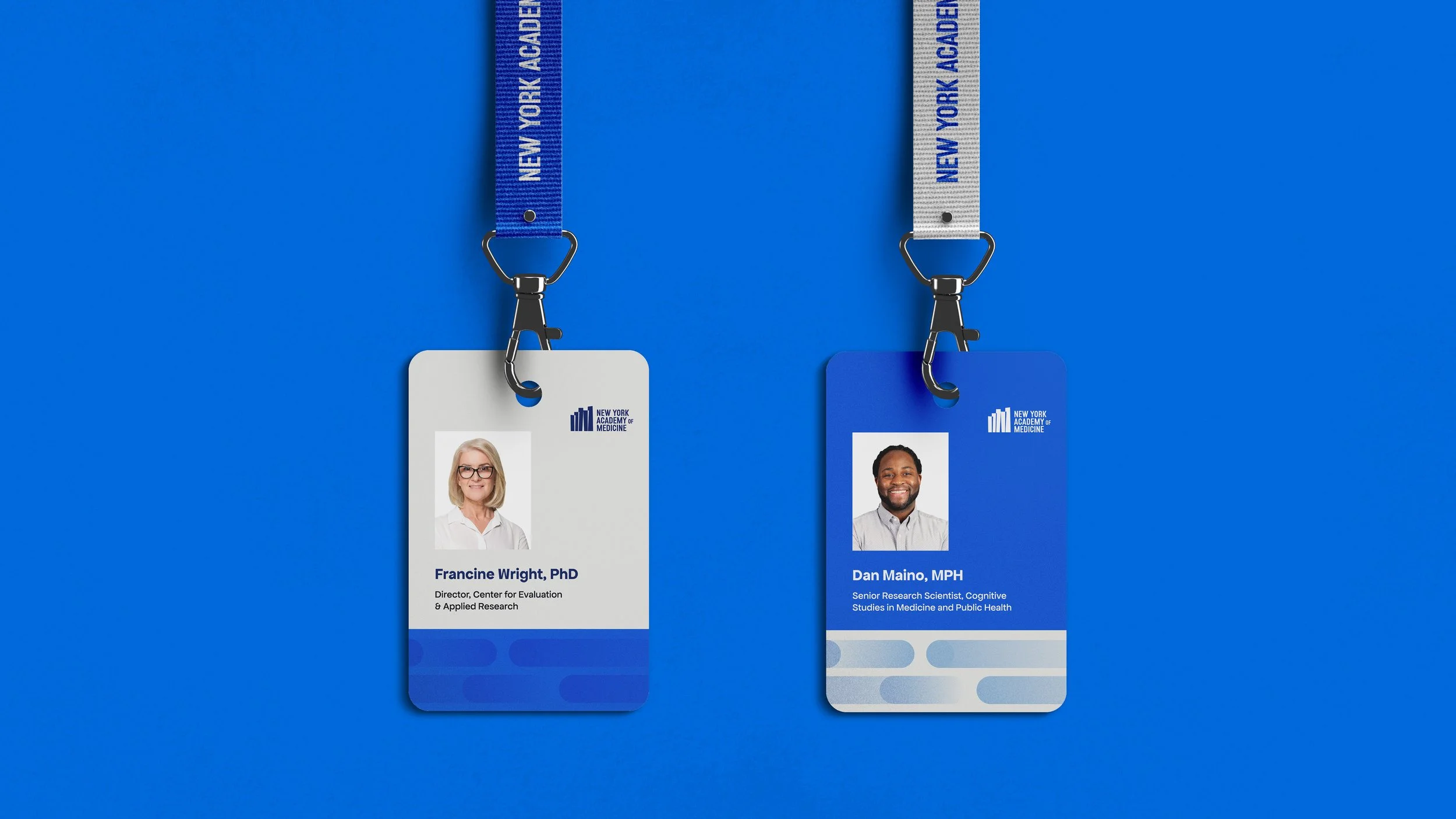
The new logo carries multiple layers of meaning. Inspired by their previous vertical mark, it nods to bar graphs, the New York City skyline, the five boroughs, and the idea of collective progress. The forms also reference books on a shelf, a tribute to NYAM’s historic research library and its role as a hub for knowledge.
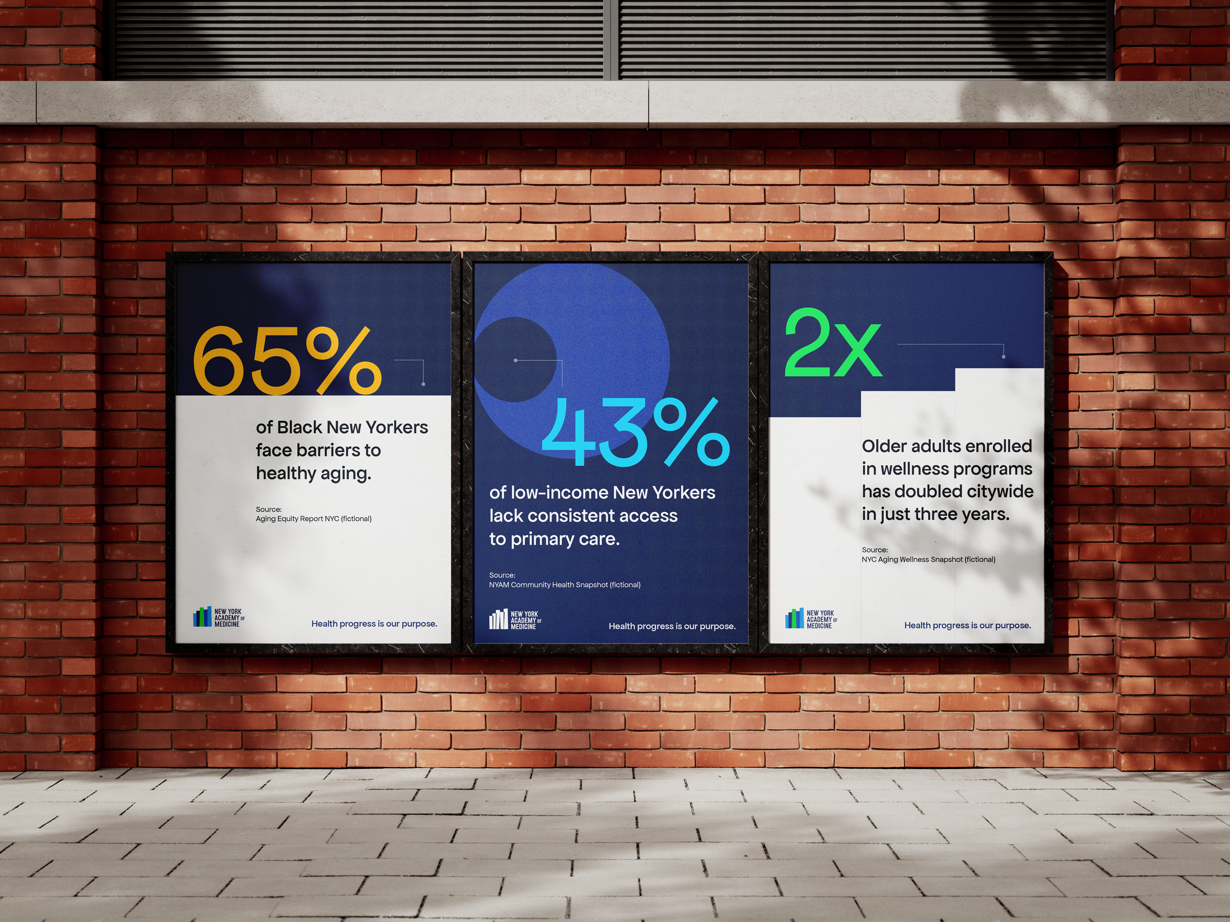
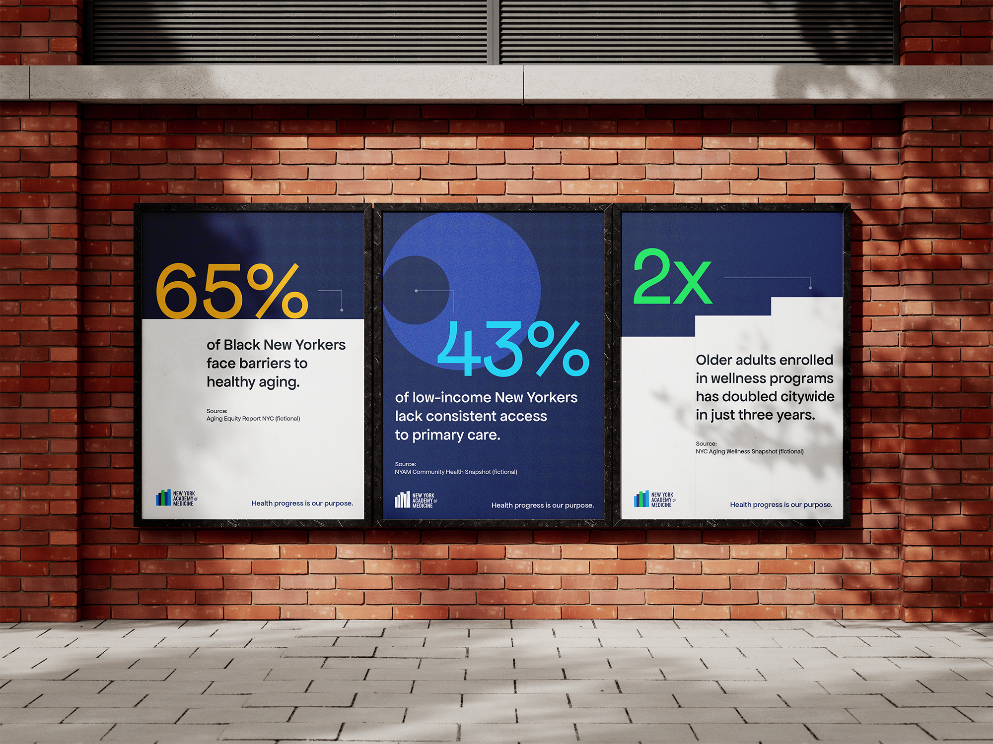
Across the system, we leaned into visual cues from data—pie charts, bar graphs, and directional forms—transformed into bold, modern elements that create momentum.
We refreshed the color palette by keeping their iconic blue but expanding it with brighter, more energetic tones. The result is a look that feels contemporary, flexible, and distinctly New York: gritty and modern, yet human and authoritative.
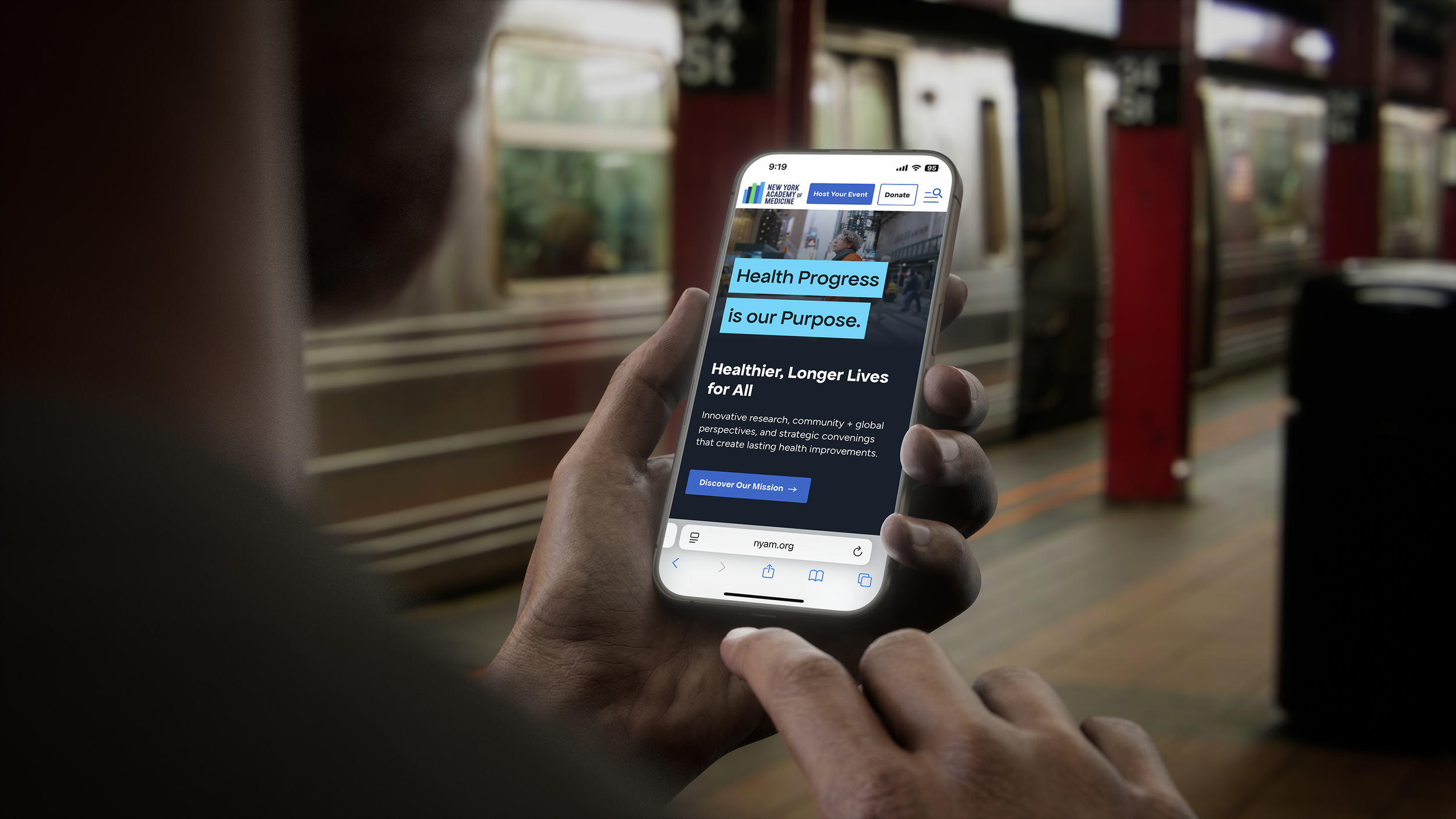
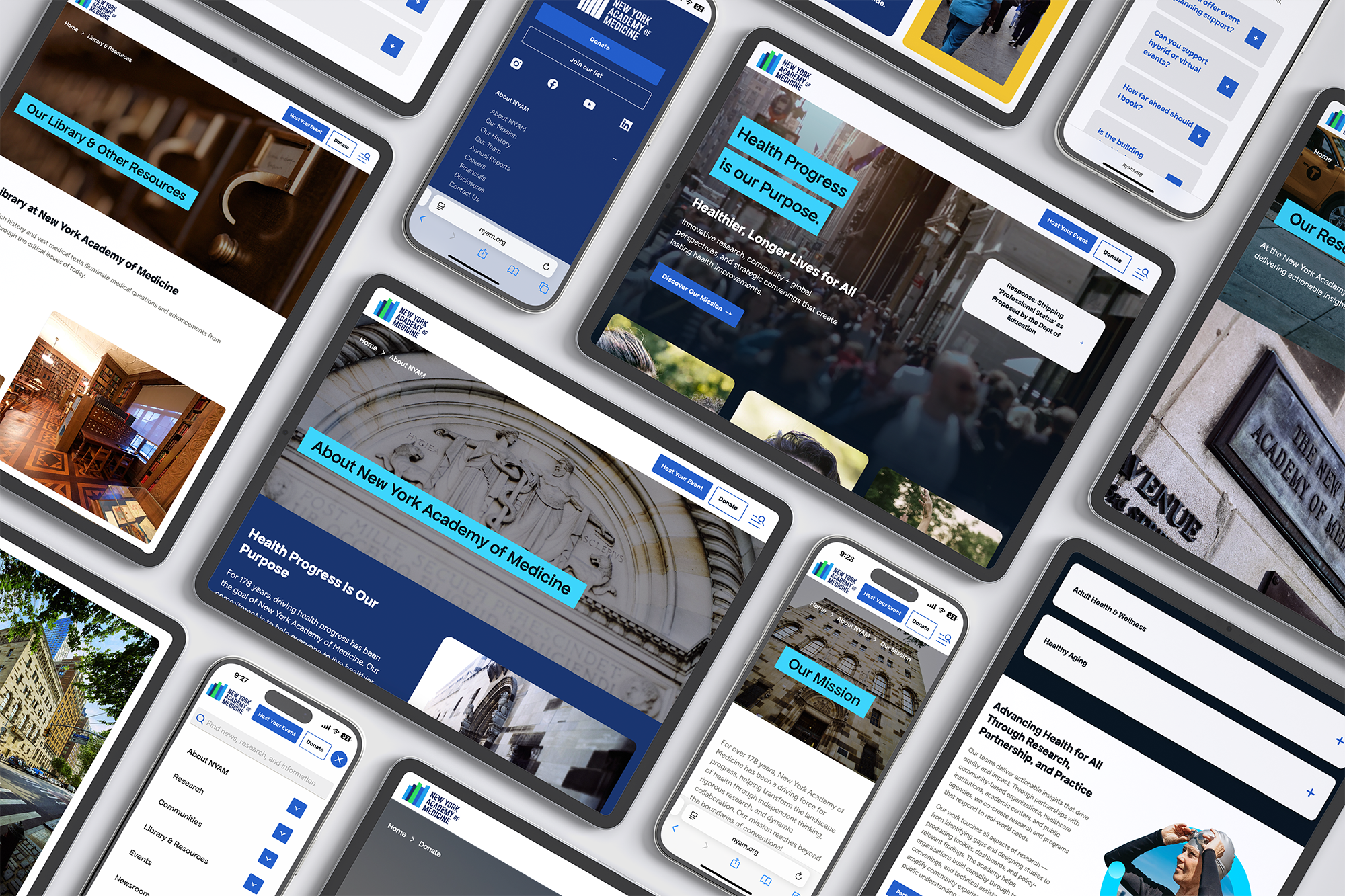
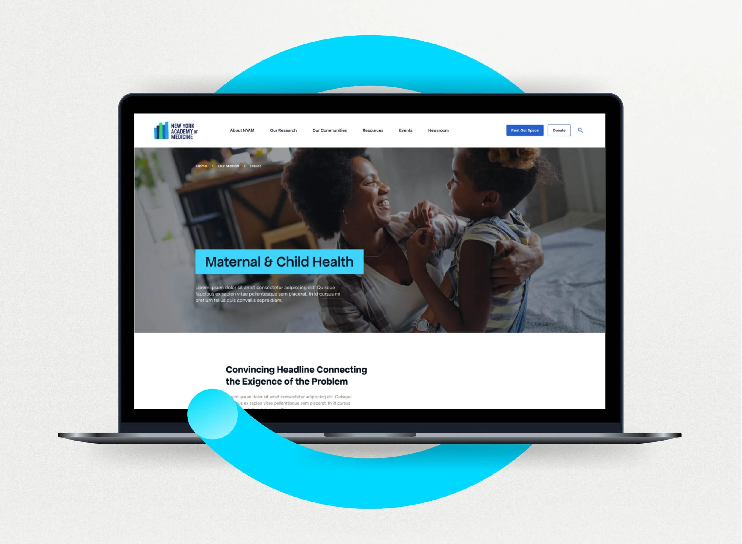
We extended the brand into a full website redesign, transforming NYAM’s deep research, programs, and policy work into a cleaner, more intuitive digital experience. The site uses the new visual system to clearly organize complex information, highlight NYAM’s thought leadership, and make their work more accessible to the public, policymakers, and partners.
The new identity honors NYAM’s legacy while positioning them as a forward-looking leader, one committed to evidence-based solutions, real-world impact, and the ongoing pursuit of health equity.
Services